In the last blog post, we went over the two kinds of definitions that are commonly applied when trying to define an economic recession. These two are (I) two consecutive quarters of negative growth in real Gross Domestic Product (GDP) as a rule of thumb, and (2) the holistic approach of the National Bureau of Economic Research (NBER) by combining various economic indicators to assess the level of decline in economic activity.
Since the latter is the type of recession typically used when looking back historically, it is the starting point for this blog post, where we will use data from St. Louis Federal Reserve to assess a potential economic recession. We aim to evaluate whether we are in a recession with one month lag to position our portfolios optimally so that we can survive if a recession occurs. Our results reveal that we can use this tool to determine a recession and the trend of economic activity in such a way that we can position our portfolios optimally even when economic growth is about to slow down.
The NBER way of defining recessions
As mentioned above the NBER believes that a recession must have broad economic implications which should be observable from a host of economic indicators. They specifically mention the following:
“Because a recession must influence the economy broadly and not be confined to one sector, the committee emphasizes economy-wide measures of economic activity. The determination of the months of peaks and troughs is based on a range of monthly measures of aggregate real economic activity published by the federal statistical agencies.”
Source: https://www.nber.org/research/business-cycle-dating
NBER has historically determined recessions by looking at the economic indicators and their peak and trough times. Within this period, they look at three criteria that must be satisfied: depth, diffusion, and duration. Ideally, each recession involves periods where each indicator satisfies these three criteria. However, in practice, it is much more distorted due to the nature and dynamics of the economic system. This is the reason why NBER always determines recessions retrospectively.
We have shown the NBER recessions through history determined retrospectively:
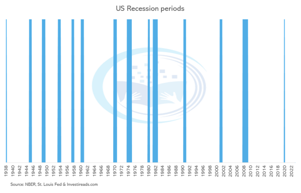
The light blue shaded areas are the US recession periods defined by NBER. It is possible to pull this data yourself by going into the data section of St. Louis Fed here https://fred.stlouisfed.org/.
You can type “USREC” into the “Search FRED data” search box and press enter. This will give you the data series for the NBER-based recession indicator.
Using the NBER way to guide our search for economic variables
A natural question from the previous section is what kind of economic variables we can use to follow the definition from NBER. Luckily, NBER has already described the type of variables that they look at. Their methodology is based on a range of monthly measures of aggregate real economic activity, which they define as real personal income less transfers, nonfarm payroll employment, employment as measured by the household survey, real personal consumption expenditure, wholesales-retail sales adjusted for price changes (inflation), and industrial production. Essentially these variables fall within the following economic categories: (I) income, (II) production, (III) employment, and (IV) consumption.
The next step is to search for an economic variable that constitutes a monthly measure of aggregate real economic activity, as mentioned above. Luckily, I have done the footwork for you and gathered the necessary keywords for each component, which are given in parentheses below:
- Real Personal Income Less Transfers (W875RX1)
- Industrial Production (INDPRO)
- Total Nonfarm Payrolls (PAYEMS)
- Employment Level (CE16OV)
- Real Retail Sales (RRSFS)
- Real Personal Consumption (PCEC96)
Again, it is possible to find these data series in the data section of St. Louis Fed by typing the keywords into the search box and pressing enter.
The growth in the economic variables
Try and graph the data first. I won’t bother you with this procedure, which you can do yourself. However, looking at the change in economic data when using it to say something about the current situation and potentially the future is essential. It also gives the neat opportunity to compare the different data sets. Comparing Total Nonfarm Payrolls and Real Retail Sales without transformation won’t say much. By looking at the change, we can express the variables in the same unit, which makes them comparable. The reasons we are taking the yearly change of each data series are the following:
- Make the data series comparable (is the percentage change of each variable?).
- Assess the direction of each data series (is the data going up or down and by how much – is the sequential change increasing or decreasing?).
By doing this we get the following yearly change in the variables:
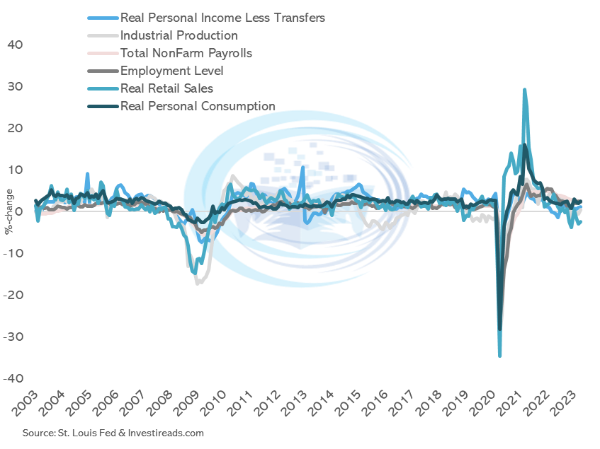
Just by looking at the graph, we can draw some interesting observations. Both 2008 and 2020 are periods where all the variables pass the three criteria of NBER in assessing economic recessions. Therefore, it is no surprise that these two periods are classified as recessions per the graph in the previous section.
Combining the variables into a composite indicator
Every month we can download the data and eyeball the change of all variables at once. This can sometimes be a daunting and imprecise task. Instead, it makes sense to combine the different variables into a composite indicator, so we only manage one variable.
Combining different variables into one single indicator can take different paths. We can make it extremely complicated by applying advanced statistical methods, or we could proceed with a straightforward methodology. We are going with the latter by combining the different variables with a simple average. Everyone should be able to replicate the model themselves, and the additional value one gets from applying more advanced methodologies can sometimes be negligible. We, therefore, proceed with a simple average of all six different growth rates.
By doing this, we get the following composite indicator: a recession indicator.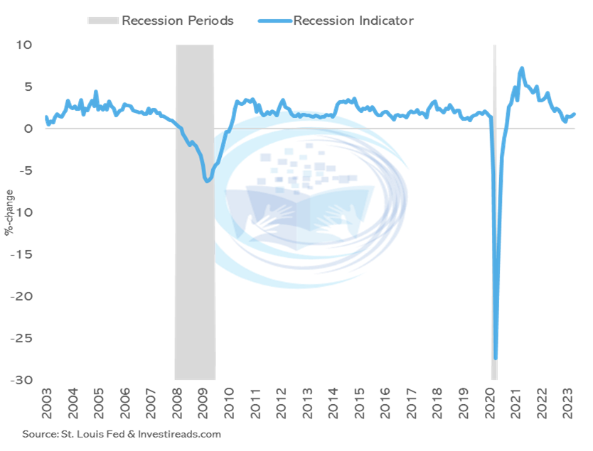
According to NBER, we should see a recession when we experience a downturn in economy-wide measures of economic activity. Hence our Recession Indicator should fall when we are in or about to enter a recession. The graph shows a pattern where the recession indicators fall and get below 0, whereas a recession occurs.
The data goes back to January 2003 when using the data from St. Louis Fed due to limitations on Real Personal Consumption. However, it is possible to substitute this with another data series and get the indicator back to 1960, which significantly improves the framework and allows for deeper analysis.
The recession indicator and financial markets
It would be relatively uninteresting if we did not draw conclusions between the change in the recession indicator and the financial markets. I will add some short perspective on this now. The first thing we can do is to see the recession indicator with the yearly change in the S&P 500. Hopefully, we see that when the recession indicator starts to fall then it will be mirrored in the development of the S&P 500.
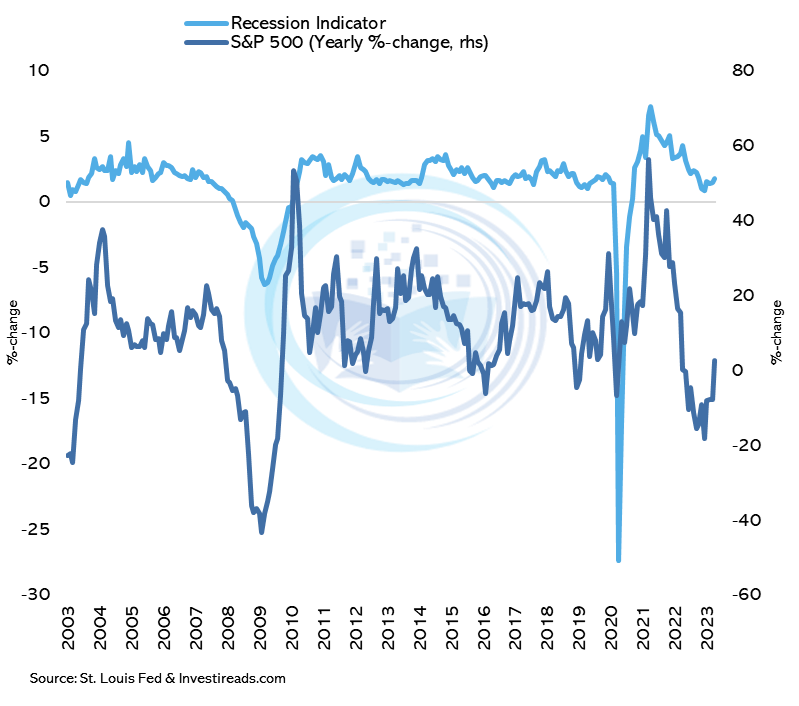
Unsurprisingly, when economic development starts to fall and gets closer to 0% growth, it takes its toll on financial development. The beautiful thing about this is that we can use this to position our portfolios optimally, whether we are heading for a growth slowdown or a full-blown economic recession. 2008 and 2020 were clear recessions, and large drawdowns in S&P 500 followed. In 2015 and 2018, these periods were clear growth slowdowns without economic recessions. Even in this case, we saw large drawdowns in the equity markets. Therefore, this tool is powerful and can be used as the guiding light in drawing a connection between economics and the financial markets.
Can we look at more financial data? Sure – but I won’t bother you with the analysis. I have made the analysis back to 1960, and we can generally draw the following conclusions:
When the recession indicator increases:
- Equities over treasuries
- Small Cap over Large Cap
- Cyclicals over Defensives
- High Beta over Low Beta
- Commodities over Gold
- Reduce USD exposure
When the recession indicator decreases it is the exact opposite:
- Treasuries over equities
- Large Cap over Small Cap
- Defensives over Cyclicals
- Low Beta over High Beta
- Gold over Commodities
- Increase USD exposure
Remember that each recession and growth slowdown is different, and it can take time for these things to play out. But hopefully you can use this template to help guide your portfolio decisions. If you have any questions regarding the above, please do not hesitate to contact me.
Before I end this blog post, I would quickly point out that to make a robust analysis of economic data, it is necessary to consider data revisions. It is prevalent for economic data to be revised and modified back in time. So, to make a trustworthy analysis, you should look at the indicator when considering revisions. It is possible to do this using the St. Louis Fed data section. They have a database called ALFRED, which contains unrevised data. To get better at this, I recommend that you try to replicate the analysis from above by using revised data.